2021.10.05
The Secret Behind EARTH Hiroshima’s Logo♡
Familiar to many is the EARTH Hiroshima logo, affectionately known as “EARTH-kun.” But what’s the story behind its shape? Who designed it?
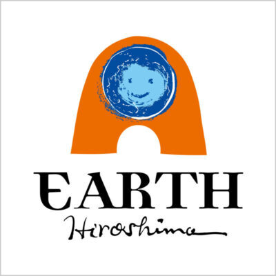
The blue circle in the middle, resembling a face, represents the “earth,” EARTH Hiroshima’s motif. The form enclosing the earth is inspired by a memorial monument. The earth is enveloped in an orange monument, symbolizing Hiroshima’s “life force.”
– Spreading the world from Hiroshima –
This concept is indeed encapsulated in our logo.
The logo was designed by Yukio Heya, President of Eizuya Co., Ltd.
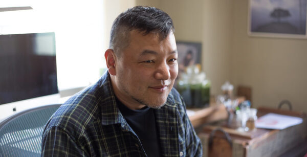
Mr. Heya, a graphic designer, illustrator, and photographer, is a veteran designer who handles a wide range of branding tasks. These include logo design, brochure design, concept proposals, store design, and space coordination. He has created over 200 logo designs for individual stores and startups!
Eizuya
We hope you now have a better understanding of the thoughts and ideas behind EARTH Hiroshima’s logo and products☆